

On Background: How To Make Perspective Serve Your Comic Storytelling
FROM THE ARCHIVES: Issue One, Page Fifteen

This week’s post continues my From The Archives series, where I revisit one of my earlier pages and provide some insight on its creation. I’m going in chronological order, so that those of you who have just discovered the comic can get caught up!
Hello there!
I’m currently travelling, away from my computer and art supplies, so for the next few weeks I’ll be doing more From The Archives posts, until I’m back home and working on new stuff. Before I left home I’d been working on a new piece of animation for the next Kickstarter campaign video, and I’m hoping to get some work done on the script for issue four while I’m away. Until then, let’s look back at this page:
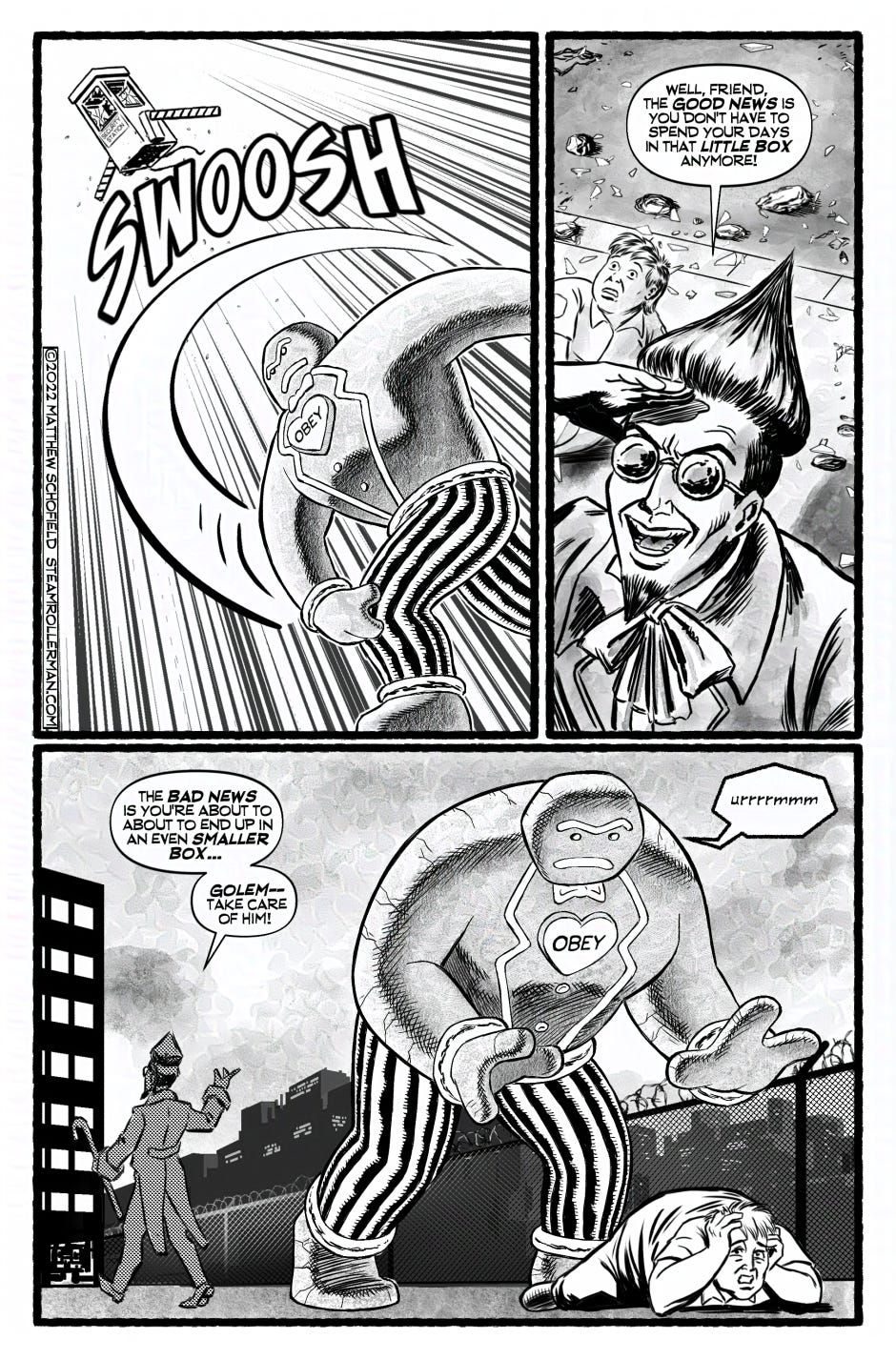
This page is quite simple in terms of story; three panels and only three (or four, if you’re pedantic) word balloons. I think it’s a good example of how I like to use backgrounds, though, so I’ll share a bit of insight into that.
I see backgrounds as serving two purposes. They provide context for the reader by placing the character in a physical space, for sure, but approaching backgrounds solely as something to fill space behind the characters misses the potential of the background as an important storytelling tool.
To me, backgrounds are far more important as compositional tools to direct the reader’s eye.
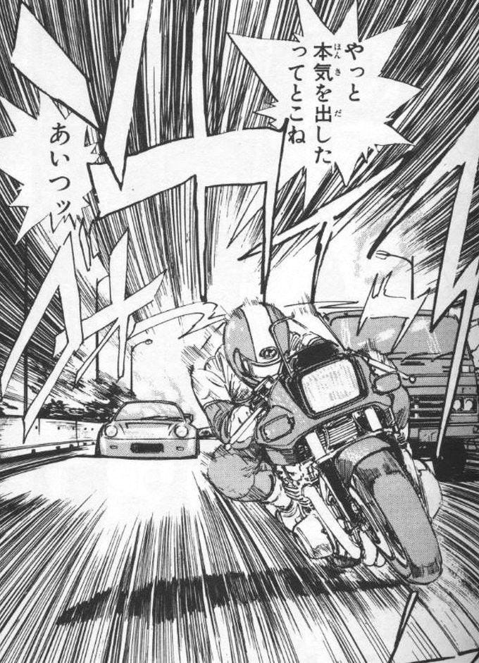
In Panel One, the background is filled with what I’ve always called “speed lines” - I don’t know if there’s an actual proper name for them, but they’re a device I primarily associate with manga, where they’re almost always used to simulate a blurred background in a photograph of a subject in motion.

I used speed lines in my panel to signify the force of the Golem’s throw, but the direction of the lines serve a second purpose - they point towards the flying security booth, and they also lead the eye backwards towards the figures in panel two. A line that has two ends, both literally and metaphorically! It also helps that the Gingerbread Golem’s arm and leg are cropped by the right edge of the first panel, which makes the reader’s eye follow the forms into the next panel.
In Panel Two, the background is just that - ground, with some rubble. The important element is the line in the concrete which serves that dual purpose I was talking about. It indicates to the viewer that we are looking down on the characters, while also running in a similar (but, importantly, not the same) direction as the speed lines from panel one, leading the eye to the characters in panel two.
Panel Three’s background is a nice low horizon, which is a great way to have the characters silhouetted against open sky, which makes for a clearer image - focusing the reader’s eye on their heads/faces. The sloping line of the fence leads the eye to Sugar Daddy’s destination, the building he will appear in on the next page. I’m putting in just enough detail to suggest the environment without drawing it all. Sugar Daddy is nicely framed by the buildings to the left and right of him. There is also a vertical fence post running from behind to Golem’s hand, down to the security guard cowering on the ground.
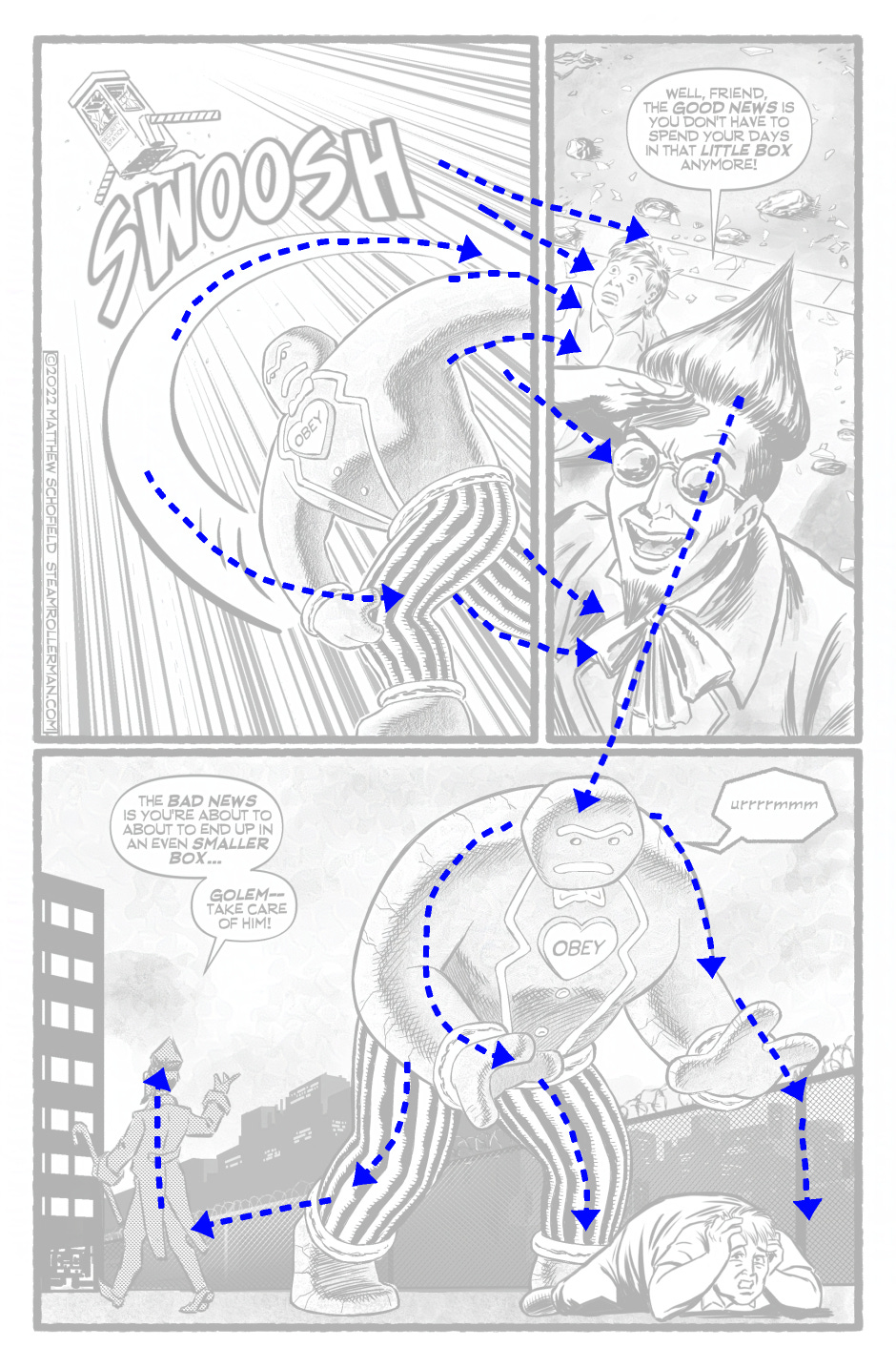
I usually hate these kind of diagrams, if I’m being honest. They always seem somewhat self-indulgent. I guess the point I’m trying to make is that every form, including those in the background, has a line of action. Adding an arrowhead to either end of that imaginary line gives a sense of where the eye is being led. Thus, every line of a background can serve the purpose of leading the eye around the composition. Ultimately, nothing should be random. Every element of a picture can have a function or mean something, if placed carefully.
I’m not saying that this page wouldn’t work without these background lines leading the eye, but I do think it makes for a more harmonious page design.
That’s it for this week. Keep Rolling!
Matt

For my paid subscribers, I’m sharing the original version of this page, plus a couple of art process images from its evolution!
Keep reading with a 7-day free trial
Subscribe to Steamroller Man to keep reading this post and get 7 days of free access to the full post archives.