

Comic Panel Composition 101: Value, Contrast & Word Balloons
FROM THE ARCHIVES: Issue One, Page Twenty-Seven — a deep dive into how I steer your eye across a single panel.

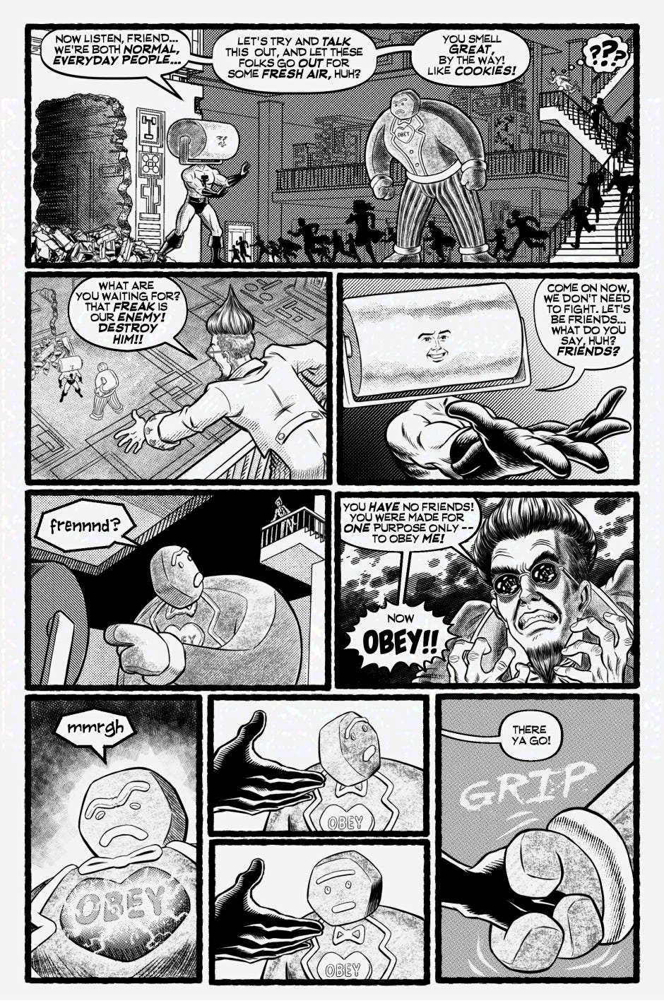
This week’s post continues my From The Archives series, where I revisit one of my earlier pages and provide some insight on its creation. I’m going in chronological order, so that those of you who have just discovered the comic can get caught up!
For this week’s post, rather than examining the entire page, I thought it might be interesting to break down how just one panel works, and how I use composition, contrast, and word balloon placement to guide the reader’s eye. So, here’s a breakdown of what went into designing Panel One!
1. Setting The Scene
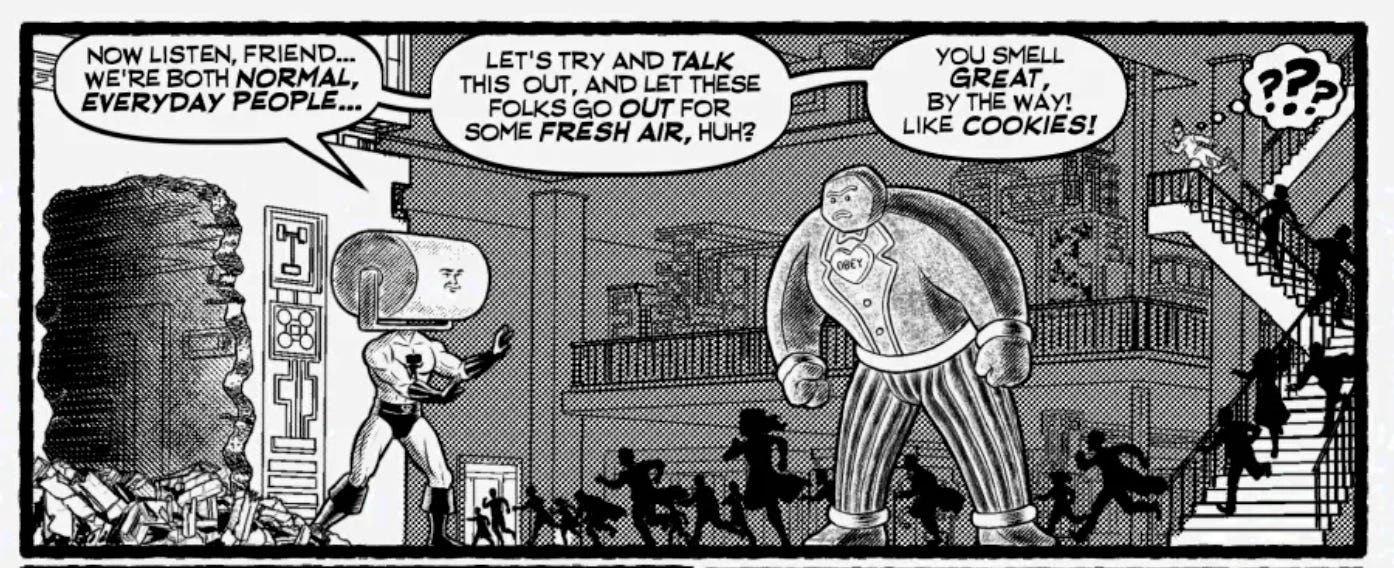
The first panel on this page is doing a lot of work!
Its first job is to re-establish the continuity of the scene: on the previous pages, Sugar Daddy had started to chase Paige Wan up a flight of stairs while the Gingerbread Golem was dispatching some security guards on the floor below, then Steamroller Man burst through the wall. So, I include the hole in the wall, the stairs, and three of the main characters. Paige wasn’t going to have any dialogue or action here, so I figured she had just run further up the stairs. I’m also introducing a new story element here by showing the occupants of the building running for the exit!
This is one of only three panels out of the NINE (!) on this page that has a background, and that’s by design. By putting a detailed, widescreen panel at the top of the page, I establish where all the characters are in relation to each other, and where they are within the space, which means I can drop the background out of later panels without disorienting the reader. But, oh! those stairs! While drawing this sequence I quickly grew to hate drawing stairs!
2. Using Contrast To Attract and Guide the Reader’s Eye
I’ve turned off the linework layer to show how I’m using contrast between light and dark value as one tool to direct the reader’s attention:
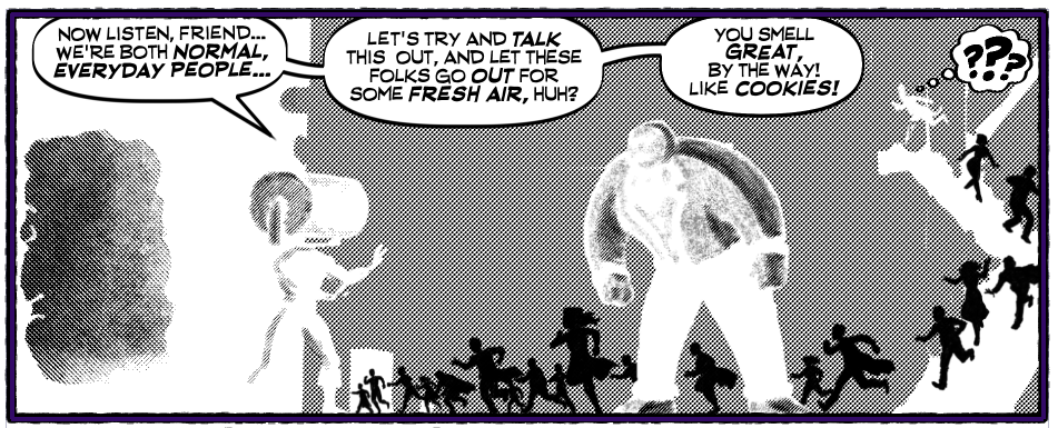
Using gray as a midtone means that both white and black will pop against it, and attract the reader’s eye.
The story elements in the composition - the wall with the hole, the staircase and the three main characters - are lighter than everything else, which attracts the reader’s eye to them immediately, serving the goal of Setting The Scene. It says “these are important, pay attention to them first.”
Having the fleeing bystanders silhouetted in black serves a few purposes: the contrast of the black against both white and grey elements makes the reader notice them, but the solid black unifies the group into an anonymous mass rather than individuals. The lack of detail means they will not pull focus from the foreground characters, but also contrast with the tiny figure of Sugar Daddy in the upper right corner. I definitely wanted him to stand out and be noticed!
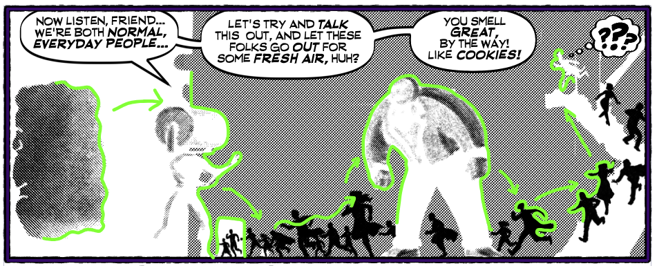
The value contrast also guides the reader’s eye across the panel. Any spot where one value butts up against another contrasting value will attract the reader’s eye. Combine that with the Western reader’s natural inclination to start on the left edge of the panel, and you have a trail for the eye to follow:
3. Using Word Balloons To Guide The Reader’s Eye
Word balloons are an integral part of any comic, and must be considered as a graphic element when composing a panel. Their placement can make or break the composition. In this panel, Steamroller Man’s dialogue is broken up into three connected balloons, arranged along the top edge. This particular placement is doing a few different jobs:
Butting them up against the top of the panel keeps the layout simple, giving me a nice open space below to compose the art.
Each balloon relates to the art element below it. The first balloon’s “normal, everyday people” line is right above Steamroller Man’s oversized head, providing comedic juxtaposition which works with - here’s that word again - ironic contrast.
The second balloon - “let these folks go out for some fresh air” - is placed right above the fleeing crowd.
The third balloon hangs in the air above the Golem and specifically talks about him, working in the recurring gag about his freshly-baked aroma.
But that’s not all!! The third balloon is perfectly level with the tiny figure of Sugar Daddy on the stairs. My intent here was to really make sure the reader didn’t miss him, so the left-to-right reading flow of the balloons would lead the eye directly to him.
For good measure, I also added a thought balloon emanating from him containing three huge, black question marks. The reader could land on this balloon by following the word balloons from left to right, or they could follow the solid black elements - the silhouettes - up the stairs to the solid black question marks, which would then lead you to Sugar Daddy. In this case, the similarity in value (solid black), rather than contrasting values, is what does the work here.
Phew! So, you can see that I’m not a guy who just throws a page together! I really do put a lot of thought into how to make the reader look at what I want them to look at. But that’s one of the things I’ve come to enjoy the most about drawing comics!

Thanks for reading this post! I hope you found it interesting! I have the thumbnail layout and the pencils for this page below for my paid subscribers!
Keep Rolling!
Matt
